In today’s digital age, your website is often the first impression potential customers have of your business. Yet, many websites fail to make the impact (and sales) they should. Let’s talk about how to fix website mistakes that are costing you sales.
Mistake #1: Your Website Doesn’t Clearly Explain What You Do
Messaging is crucial. It’s not just about what your website looks like; it’s about what it says. You have mere seconds to grab attention, so your website needs to clearly explain what you do right away. This is where many websites fall short.
How to Know if Your Message Is Clear: The Five by Five Test
You need to pass the “five by five” test:
In five seconds or less, a visitor should understand what you do and who you do it for. If a fifth grader can’t grasp it, it’s time to simplify.
Think about the first thing someone sees on your site. Does it clearly state the problem you solve and who you solve it for? If not, it’s time for a change.
Other people call this the Caveman Grunt Test, answering the two questions of “What do you do?” and “How do I get?”
This is even more needed as we move towards a mobile-first way of doing things. As people scroll through their smartphones, they expect a page that loads quickly. They want to quickly understand, in five seconds or less, what you do and how they get it.
How to Make Your Website Messaging Clear
To ensure that your services are clearly explained, start with looking at your header. Make sure that the “above the fold” section of your website, the part that loads before any scrolling, tells me what problem you solve and who you solve it for.
Another example could be: “SEO experts for B2B companies.” Or “Red-carpet Ready Pet Grooming.”
In that top section of your website, you should make it very clear what you do and who you do it for. What problem do you solve, and who your target client is.
Take a look at your website right now. If it’s not happening, you should be able to change that very quickly.
Create website messaging that sells!
“Marketing Made Simple” from our buddies at Business Made Simple gives you step-by-step instructions to make your website copy sizzle, plus breaks down how to repeat the process for ALL TYPES of marketing materials!
Mistake #2: You’re Talking About Your Company Instead of the Prospect’s Problems
The second biggest mistake we see on websites is that companies focus on themselves and what they offer.
The page is littered with phrases like, “We started in…,” “We offer…,” “We’ve been in business since…”. You are essentially “we-ing” all over your customers! 😂
This approach doesn’t resonate with customers. They want to hear their story, not yours.
How to Make the Customer the Hero
To solve this, you need to put the customer in the hero’s position of their own story, with you in it.
The simplest way to do this is to flip the focus. Highlight how your services benefit the customer. Use phrases like, “You will receive expert marketing strategies,” or “Our clients achieve significant business growth.”
This customer-first language shows that you prioritize their needs and experiences. By positioning your customer as the hero, you create a more engaging and relatable narrative.
For example, instead of saying, “We provide top-notch HVAC services,” say, “Enjoy a cooler home with our expert HVAC solutions.” This subtle shift can significantly impact how prospects perceive your business.
Mistake #3: There’s No Clear Explanation of How to Work Together
The second biggest mistake we see on websites is that there’s no explanation of how the prospect and the service provider will work together.
It’s like meeting someone and talking about how great you are but never asking them out for coffee. Your website should outline a simple plan for working together.
Think about being in a live conversation. If we met and we told you about some problems we solve and some people we solve it for, and then just stopped without explaining how we can work together, our pitch wouldn’t be effective.
How to Improve Your “Work Together” Section
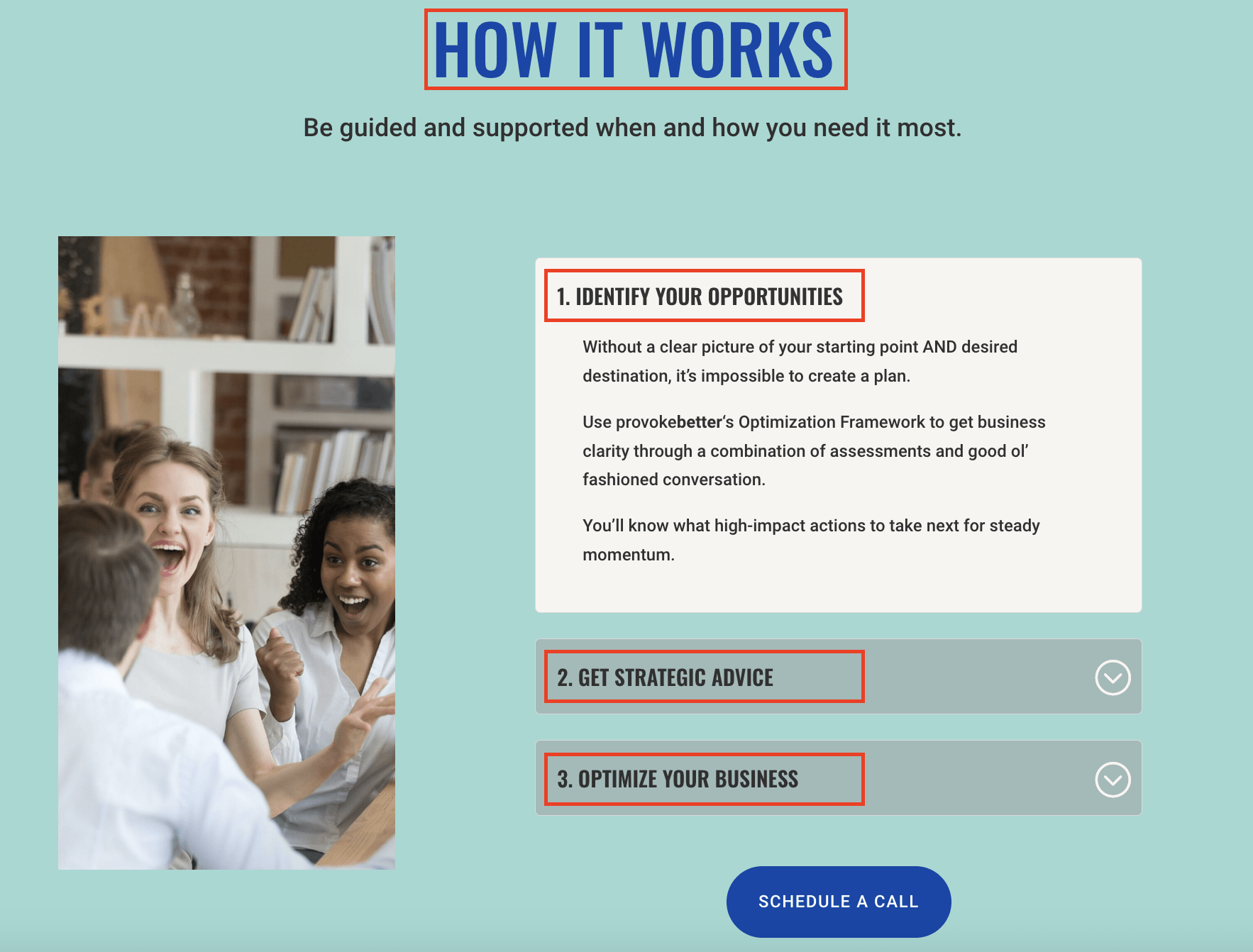
To fix this, use a simplified three-step plan on your homepage to explain how to work together.
For example, this may look like:
- [STEP #1:] Schedule a Strategy Session: Offer a quick way to get started.
- [STEP #2:] Choose Your Path Forward: Detail the steps of engagement.
- [STEP #3:] Get Awesome Results: Highlight the benefits they’ll receive.
This plan builds confidence and clarity for potential clients.
Part of this is thinking about your “foot in the door” offer. Identify a small piece of work that you can offer before committing to a larger project. This could be a strategy session, a limited-time trial, or a small prototype. Point everyone to this starting point.
Mistake #4: Your Call to Action Is Not Clear and Consistent
Far too often, I see vague calls to action (CTAs) like “Contact us” or “Learn more.” These are not effective because they don’t provide the reader a concrete action to take NEXT. Instead, it leaves them wondering.
How to Include Clear and Consistent Calls to Action
Your CTAs should be clear and visually distinct. This is where your designer can help. You want that call to action to pop, not hide it.
If you’re fixing your CTAs yourself, make sure you:
-
Use contrasting colors to make them stand out.
-
Incorporate active verbs that indicate a clear action. For example: “Give us a call” (very specific) instead of “Contact us” (how should they contact you?)
-
Keep the wording consistent across your site. For example, use “Get Started” or “Book a Call” and stick with it. This way, visitors always know what to do next.
-
Place it prominently throughout your site, not just on the homepage. Ensure it’s easy for visitors to understand what to do next.
Your CTA is like a cash register because that’s where transactions happen. Imagine walking into a retail store where the cash register is hidden. Frustrating, right?
Your website should never make it hard for visitors to find out how to work with you.
Implement These Fixes Today for a Better Website Tomorrow
Fixing these common website mistakes is straightforward and can have a big impact on your sales. Implement these changes to make your website more effective and user-friendly.
By clarifying your messaging, simplifying the process of working together, and making your calls to action clear and consistent, you’ll create a better experience for your visitors and drive more conversions.
What if we continue the conversation on LinkedIn? Share your thoughts, ask questions, and let’s discuss how you can improve your website to drive better results for your business.


Recent Comments